Fitness Website Design | Portfolio
Project Details
- Client Review I wish I could give them 6 stars because that’s how perfect this job went. No revisions needed and completed ahead of time, what more can you ask for. I highly recommend them and will DEFINITELY be using them in the future.
Website: Higher Health Standards
Type: Fitness Website Design, Health Website Design, Wellness Website Design
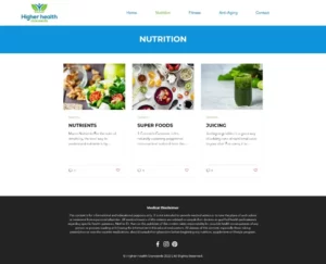
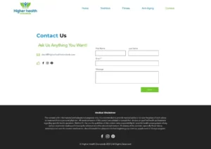
The website design of Higher Health Standards is modern, sleek, and visually appealing, with a clean and minimalistic layout that highlights the company’s portfolio and services. The site’s color scheme is dominated by shades of blue and white, creating a sense of calmness and professionalism that is fitting for a healthcare design website. The homepage features a prominent banner image that showcases the company’s work and values, along with a clear and concise navigation menu that allows visitors to easily access information about the company’s services, portfolio, and blog. The website’s design is optimized for user experience, with a responsive layout that adjusts seamlessly to different screen sizes, ensuring that visitors can access the site from any device. Overall, the website design of Higher Health Standards is a testament to the company’s commitment to quality, innovation, and user satisfaction.


