Informational Website Design | Portfolio
Project Details
- Client Review Just wrapped up a website project with PixelWave Web Design. Choosing to work with them was a decision I am extremely happy and relieved to have made. The work flow with PixelWave was natural and fluid. Communication was open, easy, simple. They understood what I was talking about intuitively. What a relief! In terms of their expertise - I was immediately blown away. For example, after supplying PixelWave with just the barebones broad strokes of what my 5 pages might look like and contain, within a day or so I was provided with a first draft 5-page website that was practically final! It was better looking than what I had even hoped for. I am the VP of a media and marketing division so I've seen my share of layout work - I was blown away. A few tweaks later and it was perfect. I have at least three more websites I need done either from scratch or revamped. There is no question my mind that I have found the shining diamond with whom I will be working on these sites: PixelWave Web Design - you shine!
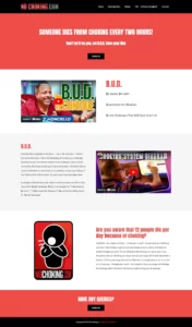
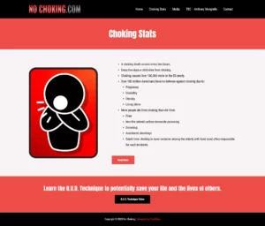
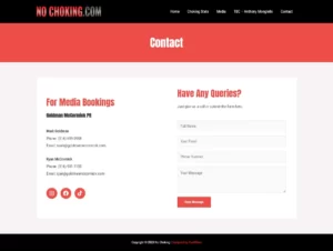
Website: NoChoking.com
Type: Informational Website Design
This website has a clean and modern design, with a simple color palette of red, black, and white. The website uses a responsive layout, which adjusts to different screen sizes and resolutions.


